
By Keely Smith, Design & Multimedia Specialist
Check out our other similar blog posts below:
How Infographics Work and Why Your Brand Needs to Use Them More
By Keely Smith, Design & Multimedia Specialist
Check out our other similar blog posts below:
How Infographics Work and Why Your Brand Needs to Use Them More

 By Chance Shay, Communications Strategist
In 2015 it’s impossible to browse a news site, scroll through your social media stream or learn about an innovative product without coming across an infographic and there’s good reason for that.
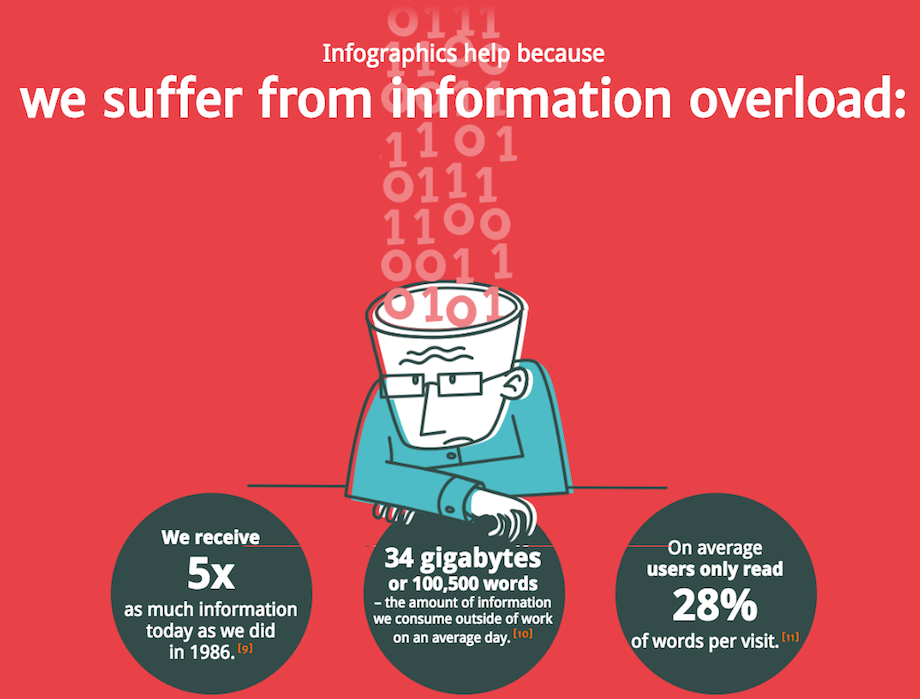
Humans are consuming more information than ever before. In fact, in 2008 Americans consumed about 1.3 trillion hours of information outside of work. This works out to an average of nearly 12 hours per person per day, which means most American’s are constantly consuming information other than when they sleep.
With so much information coming at a person each day, how does a brand communicate in a way that gives itself the best chance at having its information capture the attention of current and prospective customers?
In addition to allowing information to be consumed easier, infographics lend themselves perfectly to the modern culture of social sharing. The cool designs, fun visuals and interesting kernels of data make infographics the perfect content to share with Twitter followers, muse about on YouTube channel,s up-vote on Reddit or even write a blog about (this blog about infographics being good for blogs = blogception).
But enough words, we’ll let the visuals do the talking. The good folks at NeoMam Studios put together an awesome interactive infographic webpage (we LOVE HTML5 too!) illustrating thirteen reasons why your brain craves infographics. Some of those images are below, but visit their webpage for the full list.
And remember the golden rule: if you can communicate your message visually, do it.

Check out our related posts below:
Solution-Based Web Tools For Every PR Pro
Your Competitive Advantage is Being Human


By Keely Smith, Design & Multimedia Specialist
Branding plays an influential role in setting a business up for success. A brand is more than just a logo – it is a visual representation of a business’ values and creates an entire customer experience from the visual identity and website to social media presence. So is yours working for you? Below are 5 signs your brand is due for a refresh.
Our world is certainly no stranger to change. With the adoption of new technologies, it is  important to have a brand that moves a business forward and doesn’t hold it back. Having a “retro” identity may be intentional in some cases. However, if a brand is no longer effectively serving as a visual representation of your business and its vision and doesn’t communicate key messaging clearly, it’s time for an update.
A complete overhaul is not always the solution. Minor adjustments to existing elements, like a change in color palette or typefaces used, are very simple and effective ways to give your brand a facelift. The goal is to achieve an identity that looks timeless.
As a business grows, so should its brand. Let’s say a business changes its services offered – there has been a shift in target audience, or a new partnership has formed. A successful brand should reflect any modifications made. If the existing brand is no longer applicable to current growth and expansion, it’s time to go back and revisit the drawing board.
Are you an industry leader? Do you have outstanding customer service? Are you serious about what you do and what your business has to offer? Great! Your brand should represent everything you take pride in as a business.
A well-thought-out, well-designed brand can do wonders for paving the way to success. A brand creates a “visual reputation” and has a major influence on public perception. If you want your business to be taken seriously, you need to seriously invest in the development of your brand. It will set you apart from competitors and is a proactive way to add value to everything you do.
Do you have five or more logos? Countless ways your brand is being used? Consistency is everything, and having too many brands or different logo elements displayed across different media platforms (web, social media, printed collateral, etc.) may hinder the message your business wishes to communicate. Less really is more when it comes to a visual identity. Excessive taglines, colors, gradients and drop shadows in graphic elements are a thing of the past. We have seen a shift in design trends from the overly flashy to the minimal and simplistic.
Although versatility is not a necessity, it provides an opportunity to establish a strong and consistent visual presence. You may have a visual element or icon associated with your brand, which could be used to create a background pattern for a website, for example. You can have a dynamic branding suite, yet maintain consistency and market your brand effectively.
 There are countless platforms out there that allow anyone to create their own brand with the click of a button. Although this may be convenient and cost-effective, it runs the risk of projecting an unsuccessful or negative image. This is where investing in your brand pays off. It is important to work with a graphic designer when it comes to the development of your visual identity. Graphic design is an art form, and designers are constantly fine-tuning their skill. Designers specialize in visual communication and know how to deliver an intentional brand with a strong visual presence.
It all goes back to what you are trying to accomplish as a brand. Consistency is critical, and your branding should reflect that. Whether you’re a big corporation or a small startup, these tips will help you decide if a refresh is right for you.


Everyone seems to have an opinion on the future of Google+. A quick Google search of “Google+ is dead” nets several articles debating the future of the social network. The headlines read:
In 2011, when I got an “invite” to join the new exclusive social network, I was excited about the possibilities. Would it replace Facebook as the social network du jour? Would Google finally launch a successful social media platform (RIP Google Buzz)? I was disappointed when, within a few short months, Google+ seemed to lose its luster.
Speculators have been hemming and hawing over Google+’s longevity since just after its launch, but those questions increased last month when Vic Gundotra, head of Google+ social efforts, announced that he was leaving the company. To add to the PR firestorm, Tech Crunch published an article citing a “source” that claims that “Google+ will no longer be considered a product, but a platform — essentially ending its competition with other social networks like Facebook and Twitter.” Google denied the claims.
(W)right On’s conclusion: Don’t delete your Google+ profiles yet. While the future of the social network isn’t clear, it still provides a number of benefits for brands:
SEO: Google is a search engine, so it makes sense that Google+ provides significant SEO advantages. Google+ content itself – meaning content you post to your page – can rank in search results in instances where your website may not. Google+ also allows for near-instant indexing, whereas simply putting up new content and waiting it out usually takes a few days.
According to Forbes, “linking your Google+ page to your content via Google Authorship markup will cause the headshot and stats from your Google+ profile to show up in Google’s search results pages next to content you have written. This includes a your profile picture displaying within search results next to your content, which has been shown to draw user’s eyes and significantly improve click-through rates.”
Further, when someone follows you on Google+, it is much more likely that your content will appear higher in their search results. And when other Google+ users give a link multiple +1s, the pages shoot up in the search rankings.
No Pay for Play: Facebook has more active users than Google+. But with the latest change to its algorithm, Facebook has recently become “pay for play,” which means it’s difficult for posts to gain traction unless the page owner pays money to “boost” them. This means that “free” Facebook marketing may no longer a viable way for businesses to reach consumers.
[RELATED: Pay for Play: Will Facebook Get In Trouble?]
Quality Visits: According to a recent report from Shareaholic, Google+ actually has the second highest social media post-click engagement. YouTube took the #1 spot and Facebook is down at #5. So although Google+ drives fewer referrals compared to its competitors, it turns out the traffic it does drive is actually quite high on the quality scale. Google+ users spend more than three minutes diving into links shared by their circles, view 2.45 pages during each visit, and bounce only 50.63 percent of the time.
For these reasons alone, we recommend that brands include Google+ as one part of a comprehensive social media strategy. What are your thoughts on Google+? Is it dead, alive or maybe just sick? Join the debate in the comments.


For a business, it is important to send the right message to your audience, but it is equally important that the audience can understand your message. After all, not everyone is an expert. Today, any individual can access the Internet and find very specific answers to very specific questions, but if their questions involve you or your message, how do you know that they’ll remember that information?
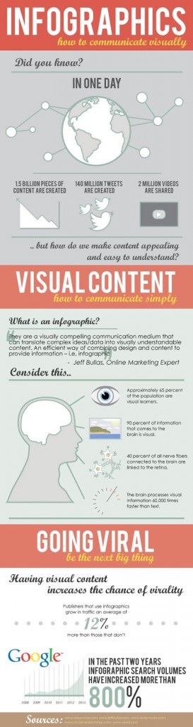
Information graphs or “infographs” are visual tools that communicate information simply and aesthetically. They take profuse and in-depth knowledge and present it clearly and concisely through visual representation. Infographs typically contain statistical information about a specific topic or field of work, but have also been adapted to communicate themes and ideas as well.
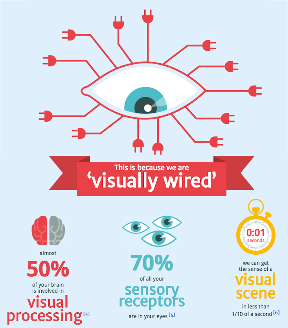
The value of infographics as a communication tool can be attributed to the way our brain processes information. For instance, right now you’re reading this article, line by line, taking in everything in the chronological order it was written. Because we read in a linear pattern, our brain cannot process information faster than we can supply it. The brain can process visual information up to 60,000 times faster than text, however. When you look at a picture of, let’s say a beach, every element of the photo is interpreted simultaneously, so you know the image is of a beach. Even when viewed separately, say separate images of palm trees, sand, or waves, you can infer that a beach is connected to these themes. However, after just describing a beach to you, you had to process that information linearly (e.g. palm trees -> sand -> waves = probably a beach).
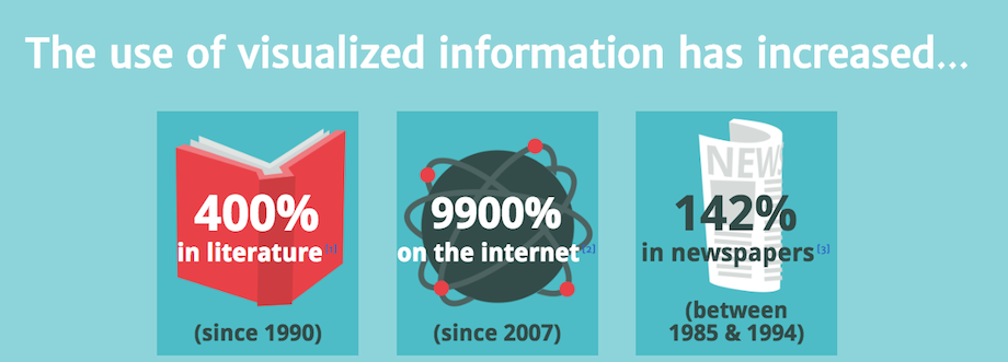
Infographics are a valuable communication tool. When communicating with your audience, as a business or otherwise, an infograph brings a level of professionalism and expertise in a given topic through your ability to clearly convey complex data or information. Additionally, people want more visual content. In fact, there has been an 800 percent increase in “infographic” searches on Google throughout the past two years. The viral potential for visual content is at its highest. Who knows, maybe your next infographic could be your breakout in Internet immortality.
 Julie Wright
Julie Wright is President of (W)right On Communications, Inc., the award-winning integrated strategic communications firm she founded in 1998. With offices in San Diego, Los Angeles and Vancouver, B.C., her team handles complex communications challenges for B2B tech, cleantech and energy, healthcare, tourism and hospitality, not-for-profit and public sector organizations. Wright and her team elevate the agency experience through data-driven insights and measurable results for client partners.
Earlier in her career, Wright served at several public relations agencies and in-house as Director of Marketing for a financial institution. She began her career as a journalist, working as a radio news anchor.
Wright currently serves as a director and past chair of the San Diego North Economic Development Council and a director of CalTravel. Her previous community service has included director of the Los Angeles chapter of the International Association of Business Communicators, board vice president of the La Jolla Village Merchants Association, trustee for the Tri-City Hospital Foundation and chair of the President’s Advisory Council for California State University San Marcos.
Wright was named a “Woman Who Means Business” by the San Diego Business Journal and a “40 Under 40” honoree by the San Diego Metropolitan magazine. She was also recognized with the annual Fran Aleshire Award for community leadership by Leadership North County and founded the LNC Alumni group, which is now 400 strong.
Wright holds a Bachelor of Arts degree from the University of B.C. and a Master of Journalism degree from the Graduate School of Journalism at the University of Western Ontario. She is a graduate of the Leadership North County program as well as the Corporate Directors Forum Governance Academy.
She lives in San Diego with her husband, has two sons in college, loves being outdoors in Southern California and Vancouver, and has a passion for elephants, frogs and Champagne. Twitter LinkedIn Facebook
 Alex Mikhail
Alex Mikhail brings more than four years of experience as a communications & public relations professional to his role as a Communications Strategist with (W)right On Communications. Alex possesses a particular interest in media relations, having established and maintained relationships with myriad producers, editor and reporters from coast to coast. At (W)right On, he’s responsible for such strategic activities as content creation, media outreach, relationship building, client reporting, etc. A native of Southern California, Alex earned a Bachelor of Arts degree in communications with a minor in public relations from Loyola Marymount University in Los Angeles.
 Alacia Lauer
Alacia is a strategic communications expert who partners with innovators to make the world a better place for everyone. She provides strategic counsel and support to our client partners, focusing on B2B and Tech. Prior to joining (W)right On, Alacia led communications for local and national organizations across the private, public and nonprofit sectors, supporting a range of issues from government regulation of the tech industry to education and criminal-legal system reform. She holds a Master of Science in Strategic Communications from Columbia University and a Bachelor of Science in Journalism and Communication from the University of Oregon.
Alacia enjoys traveling with her partner and being in nature. And she is almost ready to get a dog.
 Grant Wright
Grant Wright has more than 30 years of senior management experience including external affairs and business development leadership roles for major American and Canadian corporations and their subsidiaries. With extensive skills in all aspects of communications including media, regulatory, governmental, community outreach and labor relations; he has also led major infrastructure project development, M&A due diligence and implementation management, marketing and brand development, strategic planning and business plan development for small through Fortune 500 companies.
As CEO and Managing Partner, Grant provides oversight and senior-level communications and business counsel for the agency’s client partners while also overseeing agency management and administration.
Grant holds a Bachelor of Science degree in Biology and an MBA in Marketing and Finance. Professionally, he is formerly a Board Director of the San Diego Venture Group (now Connect San Diego – the region’s venture capital ecosystem). Grant is a two-time Finalist for the San Diego Business Journal’s Most Admired CEO Awards, and currently is in his second year as Chair of the North American chapter of the International PR Network (IPRN) based in Brussels, Belgium. He is also one of five board directors chosen by its worldwide membership for a second year to lead IPRN globally. A resident of and advocate for San Diego, and with (W)right On being a prominent tenant in San Diego’s iconic Emerald Plaza, Grant also serves on the board of directors of the Downtown San Diego Partnership.
During his free time, Grant enjoys scuba diving, hiking and family time. He is also a commercial pilot licensed in both Canada and the U.S. and is the founding board chairman of the Southern California Aviation Association that has provided more than $500,000 in student scholarship grants since the organization’s inception.
 Terry Whitaker
A communications veteran with more than 20 years’ experience, Terry brings brand development and communication programs to life through strategic counsel and event activations across the agency’s client partners. He’s most at home developing and implementing fresh ideas and strategically integrated approaches for client partners’ complex communication needs that keep the agency at the forefront of our industry.
Before joining the (W)right On team, Terry was based in Sydney, Australia and represented client partners such as the USA’s National Football League, Visit California, Sydney Festival, Budweiser, Electronic Sports League, Holden, IBM, TEDx, Major League Baseball International and numerous others.
Terry’s past accomplishments include winning a Bronze Media Lion Award at the Cannes International Advertising Festival; helping three Australian startups be named to the Fast 100; and managing media relations for the Australian speaking tours of former US Presidents Bill Clinton and George HW Bush involving hundreds of journalists and raising millions for charity.
Outside of his professional endeavors, Terry enjoys family time with his wife and two young children, travel and team sports.
 David Cumpston
David brings more than 22 years of communication experience to (W)right On’s client partners, currently overseeing the agency’s hospitality, tourism, senior living, wellness and education practice areas. He has developed and successfully led strategic communications for numerous prominent brands including JP Morgan Chase, Oakmont Management Group, Aramark, San Diego Tourism Marketing District, SEGA, RISE Healthcare Group, Horizon Organic, Visit Napa Valley, Stanford Children’s Hospital, Orbitz, Best Western, Walmart and Velodyne Lidar.
He is a two-time winner of Bulldog Media’s Best Response to Breaking News Award and earned a bachelor degree in Mass Communication & Public Relations from Texas State University. David cemented his love for travel early on and has visited more than 45 countries on six continents; he’s also passionate about dogs and, in particular, his Chiweenie mix, Dora.
 Larry Smalheiser
Larry is a strategic communications and PR pro who brings more than 20 years’ in-house, agency and independent experience driving brand visibility, supporting sales growth, and establishing executives as thought leaders in the B2B and B2C spaces. He has a track record of building, leading, and excelling on cross-functional global teams for emerging and established brands including Sony, Dell, VMware, RSA, Xerox, Virgin Galactic, Underwriters Laboratories, Purfresh, Radiant Logic, Sumo Logic and more. He regularly serves as mentor to business and community organizations and has earned two PRSA Silver Anvil Awards for his work over the years.
Larry most recently served as Public Relations and Analyst Relations Lead at Sony Electronics, where he worked closely with Sony Electronics North America President & COO, and the global team. He holds a Master’s degree, is fluent in Japanese and Spanish, and lives in San Diego with his wife and their rescue Morkie, Cookie.
 Capree Waters
Capree has more than 5 years of experience in content marketing and content strategy. She is skilled in helping elevate brands through SEO, content writing, marketing strategy, analytics, and project management. Some of Capree’s efforts for the (W)right On team include providing social media strategy, content marketing, copy writing, research and analytics, media pitching, and more. She holds a Bachelor of Science degree in Marketing from San Diego State University.
 Felicia Watson
With a proven track record of success and more than 20 years of design and marketing experience, Felicia approaches each project with a commitment to create an impactful design that achieves results. Responsible for leading the agency’s creative services that integrate print and digital graphic design, online programming, videography, editing and photography, Felicia also oversees agency services including animation, motion graphics, and emerging technologies including augmented/virtual reality and holography as they may be integrated in strategic communication programs.
Through the course of her career, Felicia has created effective marketing campaigns for many notable domestic and international brands including the Motion Picture Association of America, Kirkland, St. Jude Children’s Research Hospital, bliss Skincare, City National Bank, Abbott Diagnostics, KB Home and more.
Felicia was named a 2023 San Diego Business Journal Leader of Influence in Advertising, PR & Marketing. Felicia holds a Bachelor of Arts from the University of San Diego and enjoys keeping abreast of new creative technologies in the ever-evolving field of marketing communications.
 Aditi Vengurlekar
With a background in video editing, special effects and painting, Aditi enjoys creating strategic, thoughtful and meaningful work. Her role of Multimedia Graphic Designer, combines her decade of experience in 3D animation for award-winning studios with her expertise in developing marketing, branding and promotional materials.
Aditi holds a Masters of Arts degree in Visual Effects and Animation and graduated with honors. Apart from professional endeavors, Aditi loves to paint, swim and spend time with her family.
 Corie Fiebiger
With more than 10 years of experience in prior marketing roles in the Santa Barbara and Los Angeles markets, Corie supports the (W)right On team in multi-channel digital marketing, client relations management, social media, copywriting and copyediting, research and analytics, media pitching and more.
Corie holds a Bachelor of Arts degree in Communications from the University of California Santa Barbara.
 Brian Wright
Responsible for communication programs research and analysis, Brian provides administrative and functional support to the agency’s program leads as well as senior management. With experience managing a retail store in the complex pool supply industry, Brian is a key contributor for social media programs, media relations, content development, vendor management, software programs oversight and other critical program aspects. He brings an innate sense of the agency’s GSD attitude to help ensure the agency remains at the industry forefront.
Brian holds a Bachelor of Economics degree from the University of Victoria in British Columbia, is an FAA-licensed Private Pilot, and is an accomplished musician and music producer in his spare time.
 Shae Geary
Shae Geary is a seasoned professional with 20 years of experience representing world-class travel and hospitality PR clients. Formerly PR Director with Four Seasons Resorts and a consultant for a wide variety of resorts in California, Hawaii and Mexico, Shae began her career in Hawaii for six years with the state’s largest PR firm. Over the course of her career, Shae has spearheaded numerous campaigns involving everything from hotel openings and property renovations to anniversaries and special events. Her expertise in communications and all things hospitality includes a broad range of niche markets – spa, golf, recreation, weddings, dining, luxury, family and green travel. Shae holds a Bachelor’s degree from Arizona State University and Master’s degree in Mass Communications (with PR emphasis) from UC Santa Barbara. In her spare time, Shae enjoys playing soccer, running training and spending time with her husband and two kids.
 Roman Lukjanenko
With more than 10 years of video production experience, Roman is a skilled cinematographer, editor and animator for such organizations as HP, PetSmart, Airbnb and Nike. Prior to joining the (W)right On team, Roman supported UCLA and UCLA Health where he successfully helped researchers, educators and healthcare professionals communicate their messages through comprehensive videos and motion graphic animations. Roman believes that a well-crafted video brings organizations and their audiences closer together, improving understanding and ultimately strengthening society as a whole.
 Phelan Riessen
Phelan Riessen is a passionate web and graphic design artist with over 25 years of experience designing and building more than 60 websites for a variety of organizations. Skilled in fontography, web design, Photoshop and web marketing strategies; Phelan also holds a strong presence in the San Diego tech community by serving as an organizer of several large-scale events including RefreshSD, March Mingle and Startup Week.
 Katrina Early
Formerly with VisitBritain and Showtime Networks, Katrina Early provides (W)right On client partners’ integrated and creative partnerships with film and TV studios, retailers, and media outlets such as Sony Pictures, Universal, Warner Brothers, The Ellen DeGeneres Show and Entertainment Tonight to name a few. Experienced in the hospitality, travel, entertainment industries among others, Katrina coordinates all aspects of B2B industry events, as well as grows client partners’ audience social media engagement through highly sharable digital content. Results achieved include positive media placement in top tier outlets including National Geographic, Robb Report, Forbes, USA Today, LA Times, NBC/Today Show, E! News, Extra, The Tonight Show, People and many others. Katrina holds a Bachelor of Arts in Journalism & Public Relations from CSU Long Beach and a Master of Arts in Communications from the prestigious University of Southern California Annenberg School of Communication.
 Hamish Marshall
As Director of Research & Analytics based out of (W)right On’s Vancouver office, Hamish leads (W)right On’s survey and stakeholder information gathering initiatives North America-wide. A former advisor to the Prime Minister of Canada, Provincial Premiers, City Mayors and dozens of elected officials, he also served in the government of Canada overseeing the quantitative and qualitative research activities of federal government agencies. With experience using every sort of data collection method to provide critical insights for strategic planning, marketing and other organizational activities, Hamish has worked with dozens of private and public sector client partners, including the world’s largest mining company. In 2004 he worked in radio business development in Kabul, Afghanistan, and he has volunteered in democracy-building activities in Bangladesh and Jordan. Today, Hamish is frequently sought out by the media as an expert commentator for national television, radio and print publications. Prior to joining (W)right On, Hamish worked as the Research Director for Angus Reid Public Opinion, conducting and performing analysis on surveys in the United States, Canada and the United Kingdom. He holds a Master of Business Administration degree from the University of Oxford in England, a Bachelor of Arts (Honors) degree from the University of Toronto and enjoys history, writing and sailing.